by @wisprflow
In 2026, people ask AI before they buy anything. Wispr is the first landing page to acknowledge that. Instead of fighting it, they built it into the page. Surprised nobody else thought of this sooner.
by @wisprflow
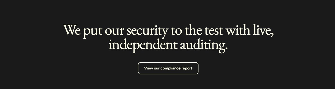
Everyone says 'we're secure.' Wispr actually proves it. Third-party independent auditing, not self-certified. And they link the compliance report right there. No hiding. Most companies treat security as a footnote badge. This treats it as a headline.

by @wisprflow
Instead of a static pricing table, they built a calculator. Slide your team size, set hourly rate, and it shows exactly how much you save. Makes the ROI personal and undeniable. Nobody scrolls past their own money.

by @plum
Awards + stats in one section. Not just 'trusted by X companies' but actual third-party recognition (Forbes Asia 100, LinkedIn Top Startups) paired with hard numbers. Layered credibility that builds on itself.
by @plum
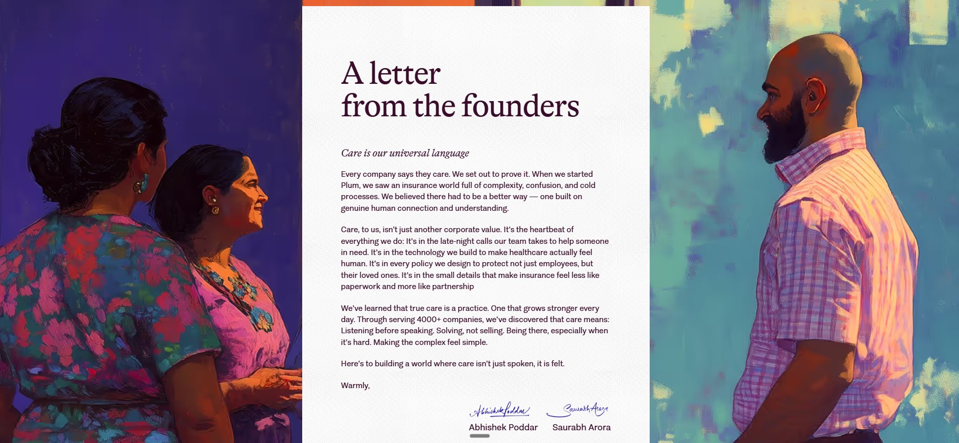
Founder letters aren't new. What makes this one special is the execution. Hand-painted illustrations flanking the letter, not stock photos. The art style matches the brand's warmth. Real signatures, not typed names. The illustration does the emotional work, the letter does the rational work. Design elevates a common pattern into something memorable.
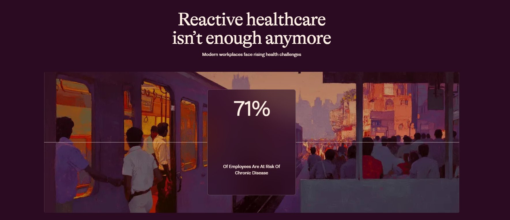
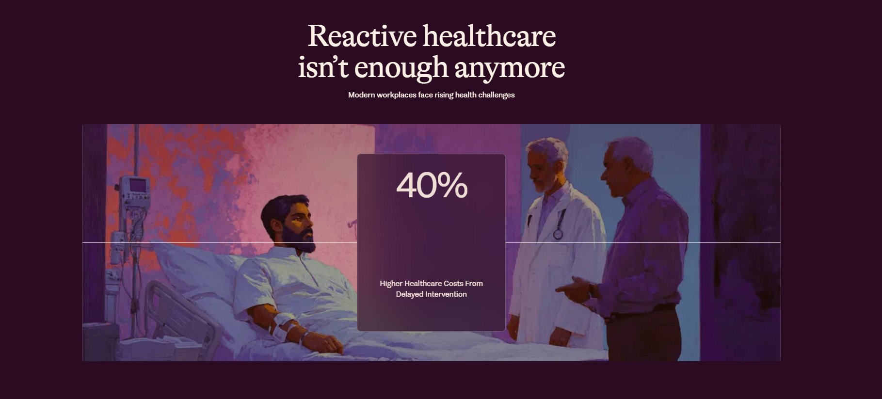
by @plum
The illustration and the stat swap on scroll but the layout stays pinned. 71% chronic disease risk, 40% higher costs from delayed intervention. Each scroll state is a different story, same frame. Keeps you anchored while the data hits you one at a time. Most stats sections dump everything at once. This one paces the impact.
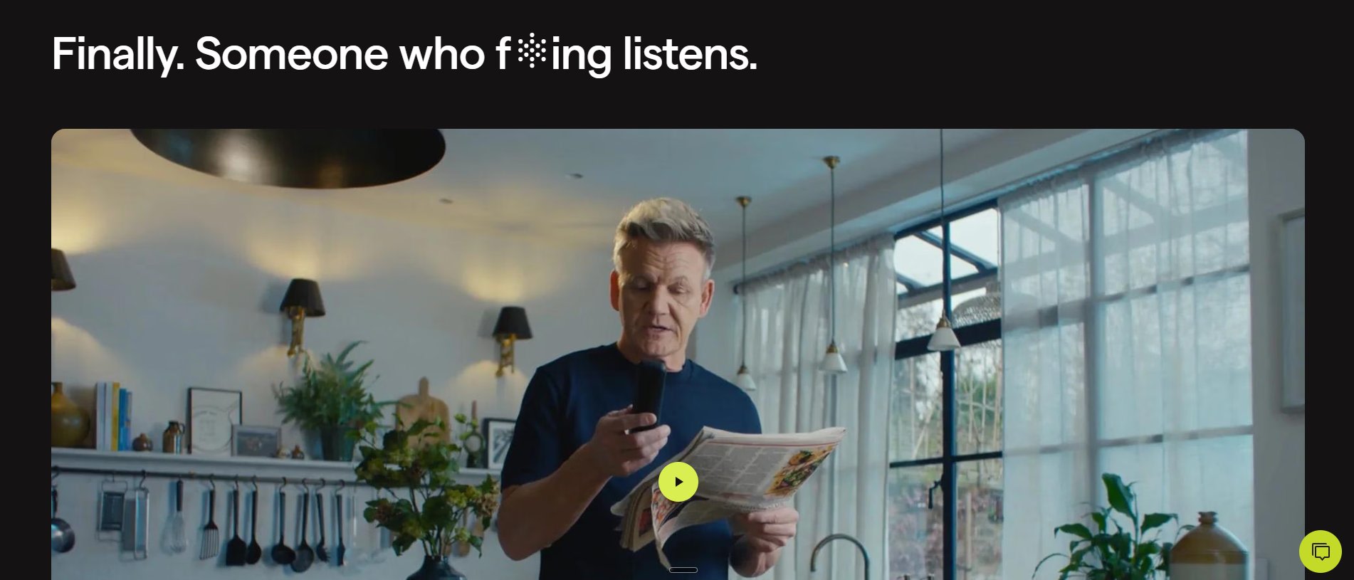
by @polyai
A full brand film with Gordon Ramsay on the second fold. Not buried in a resources page, not a YouTube link. Right there in the scroll. The headline 'Finally. Someone who f**ing listens.' sets the tone before you even hit play. Celebrity + irreverent copy + immediate video placement. Most B2B companies hide their best content. PolyAI leads with it.
by @polyai
Instead of listing features in cards or bullet points, they show the product in motion. Auto-playing video that walks you through the feature without you clicking anything. You see it working before you decide to care. Most feature sections are static. This one moves.
by @gamma
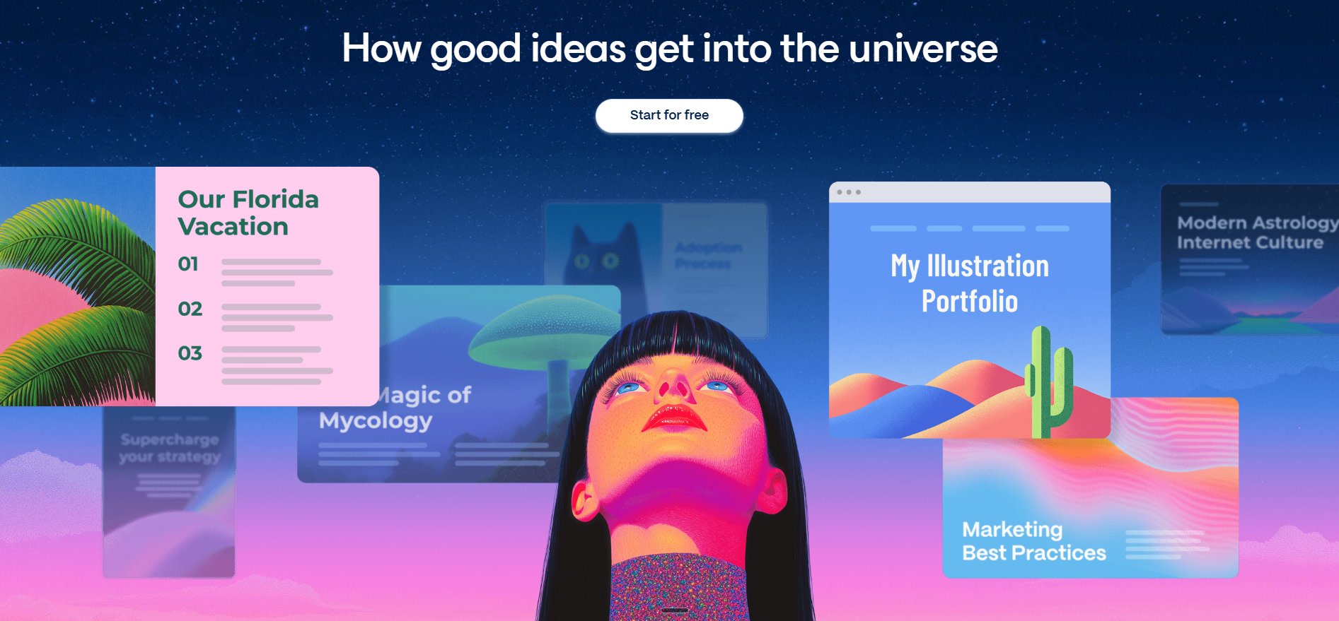
The product IS the hero. Instead of explaining what it does, they show a universe of things made with it. Floating cards, portfolios, presentations — all real outputs. The illustration of a person looking up at their own creations makes it aspirational without being corporate. You don't read what Gamma does, you see it.

by @gamma
Six words as an entire section. No subtext, no CTA, just clouds and sparkles. The gradient highlight on 'imagination' makes it the only word that matters. Most mission statements are paragraphs. This one is a breath.
by @wise
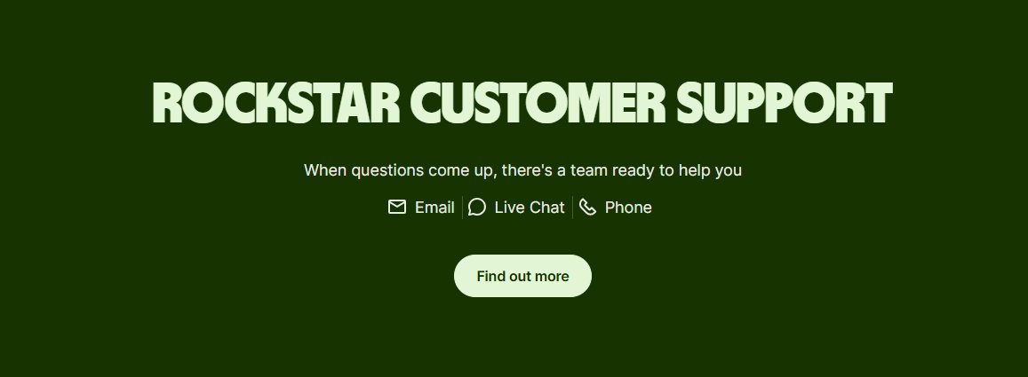
Most fintech companies say 'we have support.' Wise calls theirs 'Rockstar Customer Support.' That one word — rockstar — transforms a boring trust section into a brand moment. Bold condensed type on deep green, three channels listed simply (Email, Live Chat, Phone), no over-explaining. The confidence in the headline does all the selling.

by @wise
Warm watercolor collage of global landmarks behind bold condensed type saying 'No Hidden Fees or Monthly Subscription.' The visual says global, the copy says transparent. 'One-off fee' underlined as a hyperlink builds trust by inviting scrutiny. 'Get set up in minutes' as CTA removes the last objection. Most pricing sections are cold tables. This one feels like a postcard from a world where money just works.
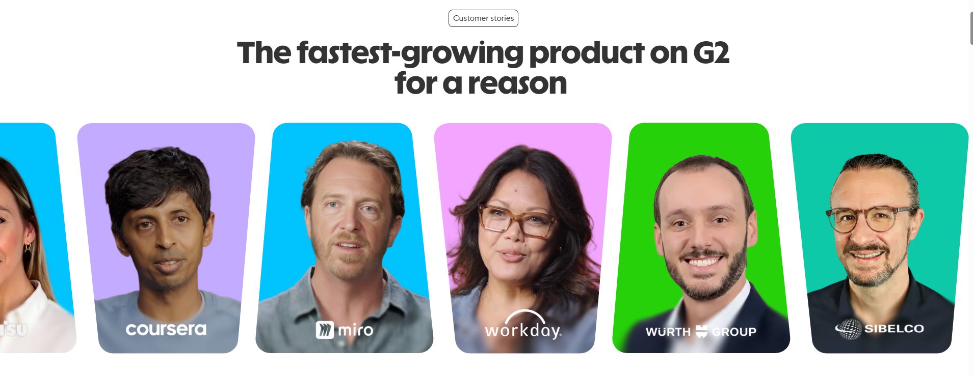
by @heygen
Real faces on bright candy-colored backgrounds, each paired with their company logo (Coursera, Miro, Workday, Wurth, Sibelco). Not quotes, not text testimonials — just human faces that look like they're about to speak. The headline 'The fastest-growing product on G2 for a reason' lets the faces be the reason. Most social proof sections show logos or star ratings. This one shows the people behind the logos.